Get Rid of the Caret on Popovers PrimeVue: When using PrimeVue, a popular UI library designed for Vue.js applications, developers often utilize popovers. A popover is a small, temporary container that appears when a user interacts with an element, such as a button or a link. It usually contains additional information, tips, or controls that enhance the user’s understanding or functionality of the application. By providing context-sensitive help, popovers can significantly improve the user experience.
However, while popovers can be very useful, many developers want to customize their appearance, especially by removing the caret—the small arrow that points from the popover to the triggering element. This caret is meant to visually connect the popover to the element, but it may not always fit the desired design.
Why Remove the Caret?
There are several reasons developers may choose to remove the caret from a PrimeVue popover:
Cleaner Design: A simple look without a caret often looks better and may fit more seamlessly with the overall design of the application. In some cases, a minimalist design approach is favored to maintain a sleek user interface.
Alignment Problems: Carets can sometimes not line up correctly, especially on smaller screens, leading to an unprofessional appearance. When popovers are not properly aligned, it can cause confusion for users trying to figure out which element the popover relates to.
User Preference: Many users enjoy a more straightforward, less cluttered interface. By removing unnecessary elements like a caret, developers can help create a more pleasant browsing experience. Some users may find that too many decorative elements can distract them from the main content.
Steps to Remove the Caret
Set Up Your Popover
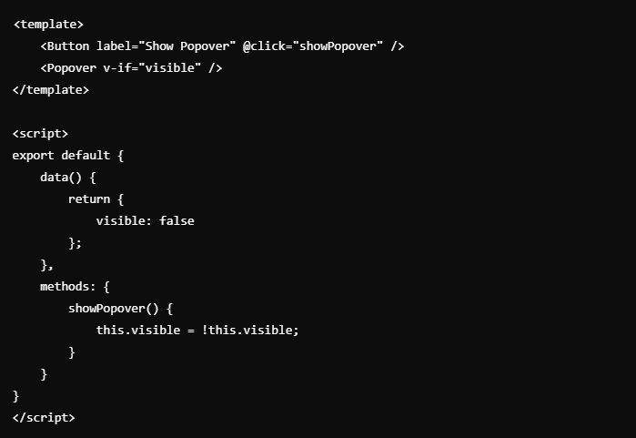
Before you can remove the caret, you need to ensure you have your popover working correctly. Typically, this involves having a button that shows the popover when clicked. Here’s a simple example of how you might set this up in a Vue component:

In this example, when the button labeled “Show Popover” is clicked, the popover appears. You can further customize this setup by adding additional content inside the popover.
Change the CSS
If you added a caret using CSS, you can remove it easily. If you created the caret with CSS pseudo-elements like ::before or ::after, you can hide it with the following CSS:

This code effectively removes the caret from the popover, resulting in a cleaner appearance. Adjusting the CSS ensures that your design remains consistent and visually appealing.
Check Positioning
After removing the caret, it’s important to look at how the popover is positioned relative to the button that opens it. Make sure it aligns nicely with the button. Without the caret, users should still be able to see which element the popover is connected to. You might need to adjust CSS properties like margins or padding to achieve the perfect alignment.
ALSO READ: Understanding Qtech Software Equity And Face Value
Make Sure It’s Responsive
When working with different screen sizes, it’s crucial that the popover works well everywhere. After taking off the caret, make sure to use flexible sizes in your CSS. For instance, you can use units like percentages or relative units like rem or em to ensure that the popover remains user-friendly on all devices. Responsiveness is essential in today’s web development to provide a good user experience on both desktops and mobile devices.
Changing Popover Styles
Besides removing the caret, you might also want to change how the popover looks overall. This includes adjusting the background color, borders, shadows, and text styles to match your app’s theme. For example, using a subtle shadow can help the popover stand out against the background, while rounded corners can give it a softer, more approachable feel.
Example of Styling

A well-designed popover can still be effective, even without a caret. Taking the time to style it appropriately can greatly enhance the user experience.
Common Issues and Fixes
Caret Misalignment
One problem you might notice after removing the caret is that the popover isn’t aligned correctly with the button. After taking off the caret, make sure that both the popover and the button are centered. You may need to tweak the margins or padding to fix this issue and ensure a clean look.
Mobile Responsiveness
On mobile devices, overlapping elements can confuse users. Make sure the popover is sized and placed properly to avoid this problem, even without a caret. Test the popover on various devices to see how it behaves. You may need to adjust the size or positioning based on the screen width.
Managing Popover Visibility
How you show and hide popovers can greatly improve user experience. Consider using events like clicks and hovers to control when the popover appears or disappears. This interaction can help users feel more in control and less overwhelmed by information.
For example, you might want to have the popover disappear when the user clicks outside of it or after a short delay when the mouse moves away.
Keeping Clarity Without a Caret
Even without a caret, you can still make it clear how the popover connects to the button. Using smooth animations can help draw attention to the popover when it appears. You might also use subtle color changes to guide users’ eyes from the button to the popover, maintaining a clear connection without needing an arrow.
Testing on Different Browsers and Devices
Always test your popover across different web browsers and devices. This way, you can ensure it works well and looks good everywhere. For instance, a popover that looks great in Chrome may behave differently in Firefox or Safari. Testing helps you spot any problems that might come up because of differences in how browsers display content.
Community Insights and Tips
Engaging with the PrimeVue community can provide valuable insights and best practices for using popovers. Many developers share their experiences and solutions in forums and discussion boards. Learning from others can help you avoid common mistakes and improve your popover implementation.
Conclusion
Get Rid of the Caret on Popovers PrimeVue can make your design look cleaner and improve the user experience. By following these steps, you can easily customize the popover to fit your needs. Whether you’re looking for a simpler look or trying to solve alignment issues, removing the caret can help you create a more polished interface.

